


1.
Over the past few years, I’ve changed a lot. I used to be super into efficiency and metric excellence. Honestly, I think they’re still a part of who I am, but I believe in different things now.
In response to the increasing feeling that most of us are pawns in a game controlled by billionaires and tech companies, I developed a sort of mantra: I’d rather play it poetic. Which is to mean that I’ve understood and played by the rules for a very long time, first out of ambition then out of survival, then out of habit as the ability to resist habitualized action and thought starts to atrophy. But what once used to be a thrilling chase of disruptive ideas and very important needle-shifting optimization backed by the gospel of data started to feel cyclical, boring, and pointless. (Exemplified in language by the word “revolution”, which means both a transformative disruptive change and just another round.)
It’s not like some kind of Matrix situation where once you “see”, the entire world changes and you are offered a choice. It’s not really like that. My world is still the same. Companies are still building their monopolies. If anything, it feels like they’re getting more ruthless and brazen about it.
So what’s the game? The most prevalent and timely right now is the game of attention. This week in business as usual on the internet: Pantone’s colour of the year 2026 announcement, and all the ensuing opinions. (*Jingle plays* Opinions? You gotta have one!!)
So here, you can have mine too. First thought: it’s boring but fine. It’s white. Honestly, I have never been head over heels in love with a single choice for colour of the year from Pantone. I am always curious to see what the projected mood will be. But I’ve figured by now, I’m not really their target market. Pantone is not forecasting colours; they’re aiming for consolidation of taste. And arguably, now they may be aiming for more than that. Like everyone else in the world now, big brands to government administrations to small creators, they want attention. Their choices usually lean safe, every year’s marketing spiel mostly the same mood over and over again using different words. But white in this climate isn’t safe. Because safe used to mean more appeal to more people. Now safe means less engagement, less attention.
Cloud Dancer isn’t a bad (non-)colour. It’s hard to call it even close to ugly. I bet there are many people whose favourite colour is white. In fact, I’d guess that more people’s favourite colour is white than a colour like teal or coral or chartreuse. Most walls are white and we have to look at them every day.
But the colour flopped hard in the eyes of the public.
(Mandatory mention that the internet “public” is not the true public. Remember the outrage when Balenciaga came out with that disturbing campaign in 2022? I can accept apologies for a bad day or less than stellar behaviour. But I don’t think this brand should get a second chance on something like this that undoubtedly went through many levels of approval. And yet here they are, back and better than ever, like it never happened. Or Sydney Sweeney’s Great Jeans campaign for American Eagle, much disparaged in the public, leading to an expected downturn in stock value…for a couple short months, and then shooting back up, to the highest it’s been in over a year. Flopping does not mean failure when attention is the game and money is the player. Or maybe it’s the other way around.)
2.
Josef Albers, a German-American abstract artist and educator, is considered one of the most influential teachers of art in the 20th century. He was known for these:
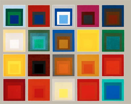
Essentially, squares of colour.
He demonstrated and spent much of his life and work on showing the power of context when it comes to colour, how our perception of a single colour can change immensely depending on what’s next to it. Here are some of his teachings recorded as mini workshops if you want to see what I mean for yourself.
I tested and validated this theory, after suspecting it for a long time. I had been frustrated with the way I was using colour. Why, when I put a bunch of colours that I really like all together, they all look worse and uninteresting? Like they all somehow lose their magic. What was I missing?
I had to pay more attention to figure it out.
This year, I started taking photos and videos out in the real world whenever I saw a colour that caught my eye, and then bringing it home to swatch on my computer, like I was some kind of mad scientist putting my subject—light, which is what colour is, or at least our interpretation of it—under a microscope.
But the colours I swatched were not exactly pretty. They never looked the same as the moment that had first caught my attention.
For example, I spent months painting the colour of the sky, eventually noticing that the real colour of the sky on many days here in the Pacific Northwest was somewhere between blue and yellow but not green. When I swatched what looked like a bright blue sky fading into the light of the horizon, I got a muddy pale grey-green. Huh. If I squinted really hard, I could make it out. But my eyes certainly didn’t perceive it as blah or muddy at all.
Colours look beautiful in the real world because of the cumulative effect of light, the gradients found in nature, the way colours interact with each other and with what surrounds them, the material they are made of.
Don’t tell me you don’t love the way the sky looks on a really beautiful day. The really beautiful day is the sky, even if your favourite colour isn’t “blue”. But it’s the totality of the sky that makes up our perception of that colour. In reality, the sky on its best days is mostly the colour of Meta.
Context and dimension and texture matters. Flat 2d colour on its own like that doesn’t do much. It can’t.
So, actually, beauty is not in the eye of the beholder, but in the context of the beholden. I can like that white, depending on what it’s for, how it catches the light, etc, etc. But I don’t because it’s just there.
There’s not a lot Pantone can do here, since the whole point is that they can distill the year into a single flat colour. They tried, I guess, with a smattering of blue sky behind said white clouds in their hero image. But isn’t that cheating because it’s technically blue?
The most hilarious thing is that on Pantone’s page introducing the colour: clearly not the colour they chose but this.
Cloud Dancer should’ve been a pale blue, but I may be biased.
3.
There’s the reality of things and then there’s the fantasy of it. Both make up our experience.
“Cloud Dancer” as a concept requires translucency, lightness, bounce, motion. A single swatch of colour in a flat form viewed from a screen can’t do that. And when there’s too much distance between reality and fantasy, it feels desperate, gimmicky, inauthentic, and hyperbolic.
I think the hate could’ve been tempered had they chosen a word that was more grounded materially, something like porcelain (fragile), or milk (basic), or even chalk (nostalgic). People might not get the humour but at least it’s not tone-deaf. “Cloud Dancer” is saccharine and idealistic, and the mood du jour certainly isn’t idealistic. It’s a pretty set of words, but the mood of the world isn’t pretty right now.
A “Colour of the Year” doesn’t exist in a vacuum. It can’t. It is named such and not “Pantone’s Favourite Colour” because it is chosen to convey the mood of the upcoming year. Given this, it is attached to that context and people will see it in the context of “what’s happening”. White doesn’t feel like how the world feels right now, and when you cut that direct correlation out of the equation because it obviously isn’t right, the colour is less about how things feel and becomes more about how things could/should feel, which is often a pendulum swing of the former. It’s the difference between truth and ideal.
What does it mean when a company makes that kind of claim: that their ideal is white? What does it mean and how are people supposed to feel when they make that claim in America in 2025?
All outrage and personal taste aside, practically speaking, it just doesn’t feel on trend—and isn’t that the whole point? I have a personal theory that the dominant neutral cycles in and out of trend every decade or so, between grey, beige, and white. The 2020s don’t feel white. (Cars and computers are pretty good indicators of the baseline neutral, I find.)
So my only logical conclusion is that the colour wasn’t chosen to be accurate. It was chosen for attention, which isn’t surprising.
That’s just the game now, isn’t it?
4.
If you follow me on Instagram, you may be on the receiving end of me trying to show up again after being off the platform for two-ish years. During this time, I’ve been taking my creative practice to a more material place, trying to get back to who I am and what I used to loved before I got caught up in all these games. I am trying to show my process, my outcome, and my trajectory. But it’s challenging. It’s hard distilling many things into one singular idea/post/colour.
Sometimes I wish that I could move on to sharing bigger, more complex work sooner, something that gets the reaction I am chasing. Not outrage but wonder. But it takes time and effort to notice the world, and to get what I want to share right. For now, I am aiming to create something that leaves an impression in the depth of its attention, rather than in how impressively disruptive it is—and for some reason, I keep gravitating toward the small and singular.
I used to be more self conscious of that. But I have been learning. Something that has helped me is learning more about abstract modern art, like Yves Klein’s big blue square and Rothko’s paintings. I haven’t seen either in person but I keep hearing that the experience up close is enough to bring people to tears. (I also keep hearing that a lot of people don’t consider either real/good art.) How exactly does that happen? Is there anything physiologically happening to our bodies and minds looking at a painted blue vs blue on a screen? I used to think not really. Perhaps slightly, but overall, not really. Rothko’s process is described as very complex, even though what we end up seeing can accurately be described as squares of colour. Can there really be a difference looking at a painting that is made up of a single layer of paint that looks the same as another one made of many layers? What if we are not feeling what we see, but something else? Maybe the visually indistinct but indefinable quality of human intention.
When I went to see the Mona Lisa at the Louvre for the very first time back in 2017, the experience was not what I expected. I wasn’t really expecting anything. I’ve already seen the picture many times, it being one of the most famous paintings in the world.
From the corner of my eye a few dozen people away I caught her looking and I swear the universe tilted a fraction of a degree, cloudless blue into an ocean with half its colour and twice its metaphors.
It’s not necessarily the fact that it was in person and right in front of me. The crowd was large and bustling, so I didn’t really get that close. I have been to many museums and art galleries and been unaffected by a lot of art. So I can’t really explain what gets me and what doesn’t.
But since around that time, it’s felt like I’ve been infected with some sort of virus. A virus of trying, of seeing.
I’m trying. I’m trying to find a tempo. I’m trying to find a way to unflatten my own personal world, even as the world tries its best to flatten everything, to turn everything into a mush of outrage and crap. Years ago, none of what I’m doing now would’ve seemed worthwhile or important compared to the work I was used to, pumped up by all the things I no longer care about. But I’ve changed, amidst a world has become more of what it was, cycling through the same old. Revolution meets revolution.
What do I have to show for it?
Some days I am tempted to think, well, not much. Other than maybe now an elite 1% level understanding of colour.
But what do I have to show for anything? The average lifespan of a wildly successful startup is shorter than you’d think. The average decade of a human life goes by always quicker than we imagine it will. My five-year-old niece describes it like this, when I ask her what happens after kindergarten: “(Thinking face) (Big grin) And then we diiiieee.”
There’s this scene from Euphoria back in December 2020 that I love. Go ahead, watch it:
“You’ve got to believe in the poetry. Because everything else in your life will fail you,” Colman Domingo’s Ali says to Rue.
I have moved on from chasing the next big idea to small acts of poetry, small acts of beauty. Despite, or because of, everything.
This is what I believe now: the world is ugly, disappointing, shocking, and devastating in all the ways it fails us. But I still believe in the poetry. Poetry is not about seeing the glass half full, but living does not require that we do.
And the best thing is, “You don’t have to believe in something for it to startle you awake.” (From the poem Look by Franny Choi in “The World Keeps Ending, and the World Goes On”.)
5.
Pantone should hire a poet.
Because the thing is, if you’re going to go with a non-colour like white, you have to sell it right. It could be beautiful, it could be boring. But what we get is always another run of the mill marketing spiel. Something “feel good”. Something A/B tested to oblivion. Something about optimism, looking forward to some thesaurus word swap from whatever was used the year before. (This scene from the Wicked 2 trailer/movie comes to mind:
“GLINDA: Well,I’m a public figure now! People expect me to--
ELPHABA: Lie?
GLINDA: (fiercely) Be encouraging!”
Maybe Pantone fancies themselves a Glinda.)
In an era where AI is equipping even the most inept of writers with the ability to come up with basic copy, anything close to that just isn’t enough anymore. The language, again, wasn’t bad. It just feels the same, because that’s the game.
But again, my whole thing now is all about playing it poetic. And trying.
Poets are great at telling the truth. You could call this white anything, because the truth is, it is everything. It is the wax of a candle, a sheet of copy paper fresh from the machine, the cloudy bloom of a nebula cooling down, bar soap still glossed from a shower, the shell of an android before it gets its skin. This white is all these things, minus the necessary flattening required to turn real world colour into screen-rendered colour.
I don’t find this act of specificity “flowery”. I find it precise. Accurate.
It’s absolutely possible to market a colour like white so that it makes sense. You can even keep your precious controversy and outrage because at the end of the day, it’s still white in America in 2025. It’s not my favourite, after all, I have realized that no flat colour can ever be, but I can see how you could make it interesting and accurate. They didn’t.
But a poet could’ve killed it just by telling the truth.
(Related reading: Poets are now cybersecurity threats: Researchers used ‘adversarial poetry’ to trick AI into ignoring its safety guard rails and it worked 62% of the time via @kristenvannest on TikTok.)
(I actually have chosen my own colour of the year every year since 2023, after being let down by Pantone’s. And I pair it with a poem. 2026: TBD! Here’s 2025.)
(Also 😭 at everyone posting their year-end roundups already, I still have more books to finish.)
I have a question for you if you got this far! (Thank you.) What’s your personal colour of the year for 2026?
a) I started googling this Cloud Dancer cause frankly I've no idea what color Pantone has chosen, and immediately stumbled upon an article with a bunch of names, some are really funny:
https://www.northcoastjournal.com/life-outdoors/seriously/rejected-names-for-pantones-color-of-the-year-cloud-dancer/
b) I actually quite love it, -precisely as you say, it's a part of. Being so pervasive in nature. A beautiful part of beautiful. The context can be different, ranging from happy to extremely sad
You know no less than me that there is cultural aspect to how how the colors are perceived- white is actually the color of mourning in many places. So to me, one doesn't negate the other. I don't perceive this shade as a happy color, for example.
Mist would be a good name. Not here not there.
Thank you, I love colors and reading about them